When I started discussing with my quilting friends Carla and Giovanna, about the new game to be proposed as a Quilt Improv Studio challenge, I was reading the book Abstract Art. Carla’s proposal to try quilting a monochromatic work was perfectly fitting with the chapter I was reading then: the history of American Monochrome paintings.
At the time to start my monochrome quilt, I decided to experimented a bit with extremes.
I kept the shapes to a minimum (a good occasion to discover the difficulties of minimalism).
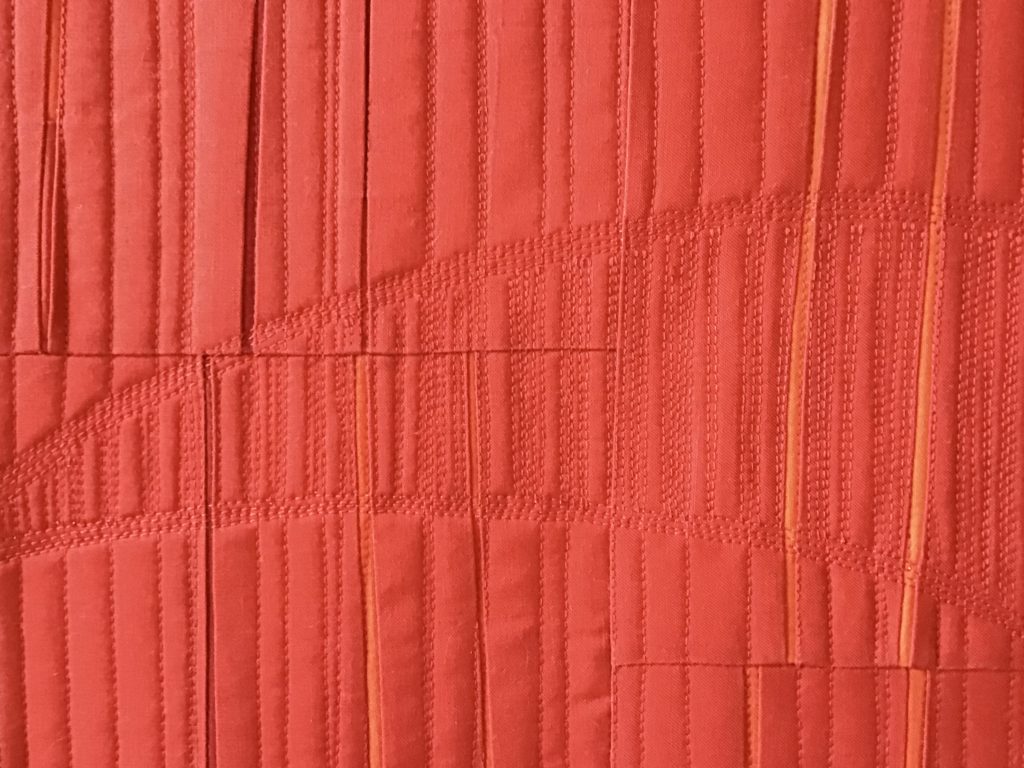
As in the monochromatic painting experiments, I focused on surface texture, quilting red on red, going narrow up to matchstick style.
At a certain point, the differences introduced in my quilt started to be barely visible even for me… and this reminded me of a photo galley I made twenty years ago, participating to a science congress on nanotechnologies, dealing with objects having size sometimes too small for being resolved by visible light.

Well… red is the color at the gate of visible light wavelength.
Thus, I decided that my red quilt had gained grades to be dedicated to all the above.
My monochrome quilt is titled “Threshold of the visible”. It makes me think of my experience with microscopy and surface characterization, of the American monochrome texture paintings, and of the wavelength where we start to see red: 740 nanometers!


Sooo intriguing, especially after reading your backstory. Love the work you did here!
Thank you Debbie, sometimes one needs to try limits up to where it’s maybe too much… otherwise, it wouldn’t be a real test!