I’ve always loved maps.
I collected maps for cycling and travel.
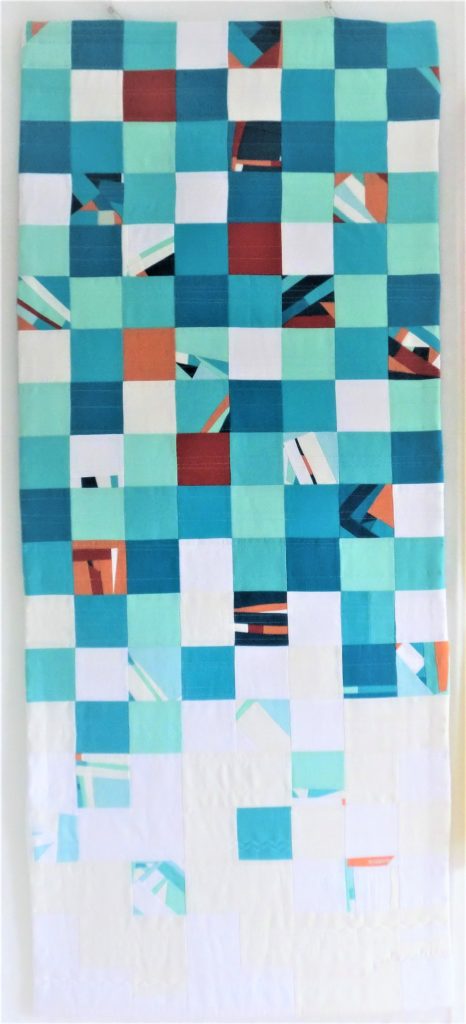
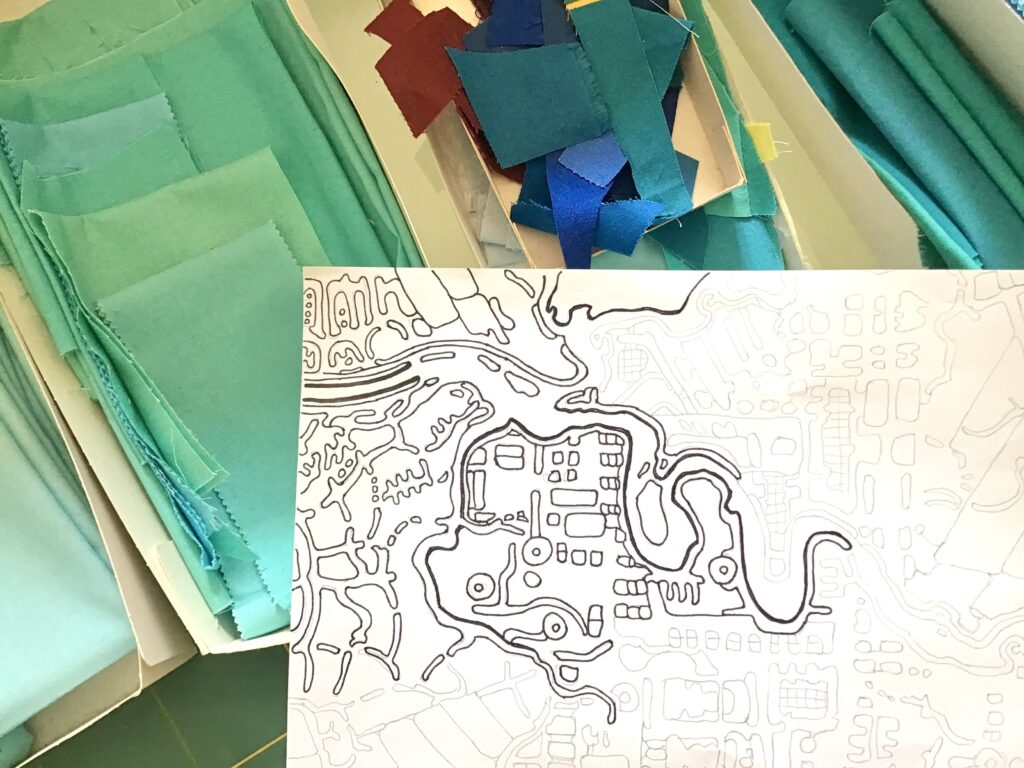
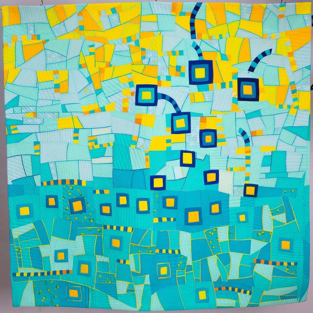
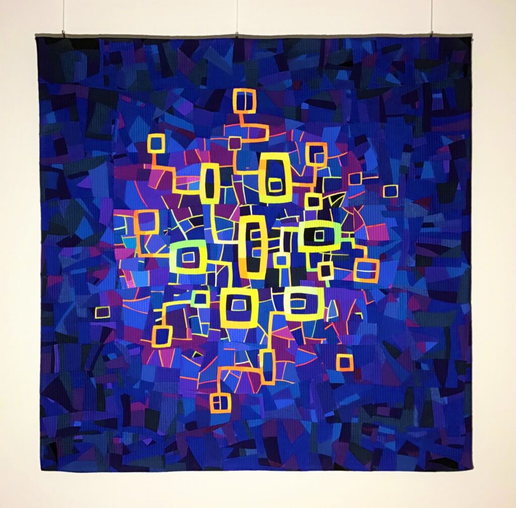
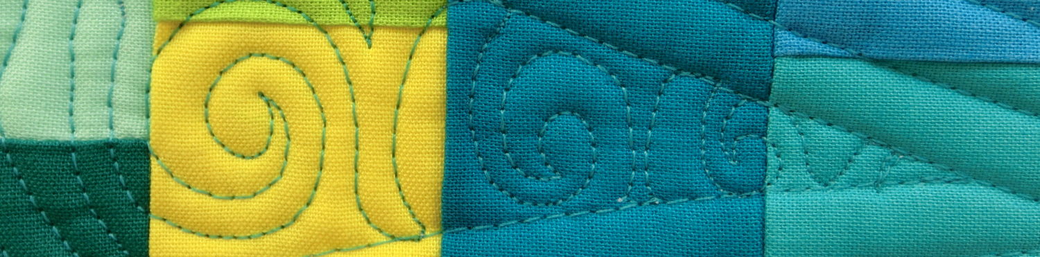
I made some map quilts.
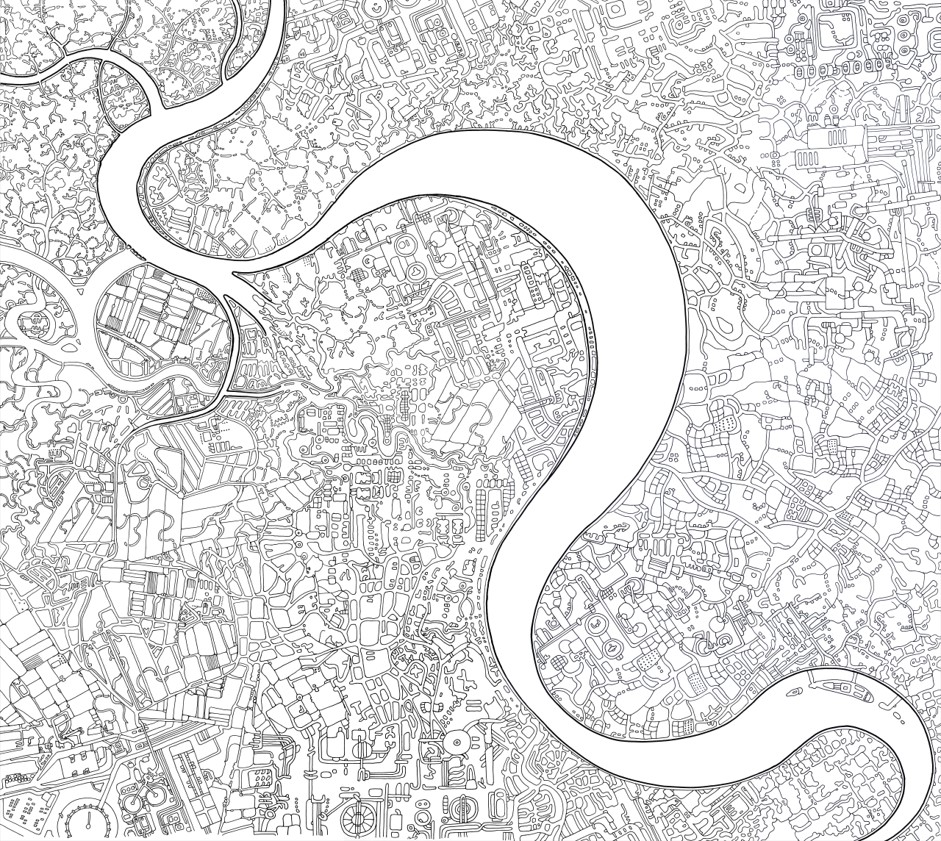
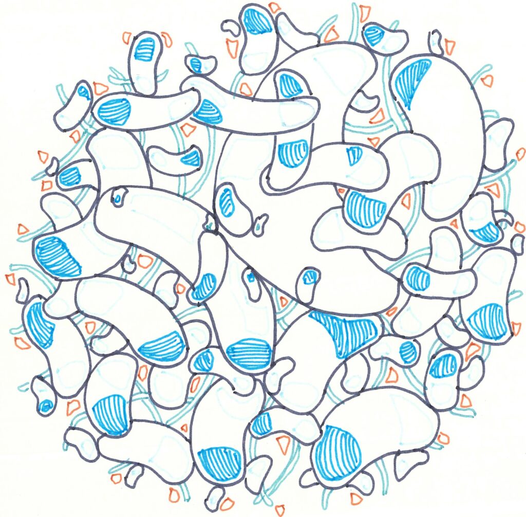
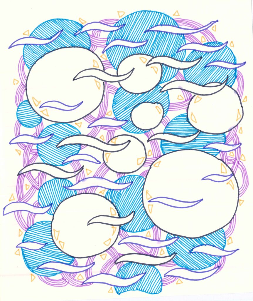
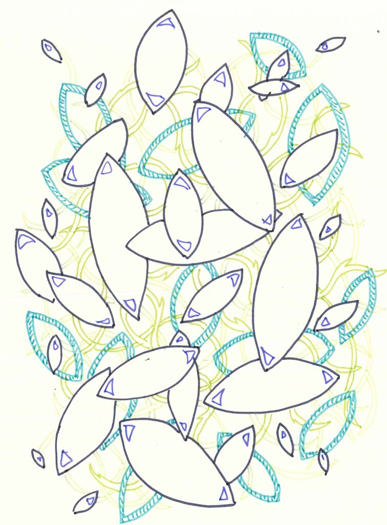
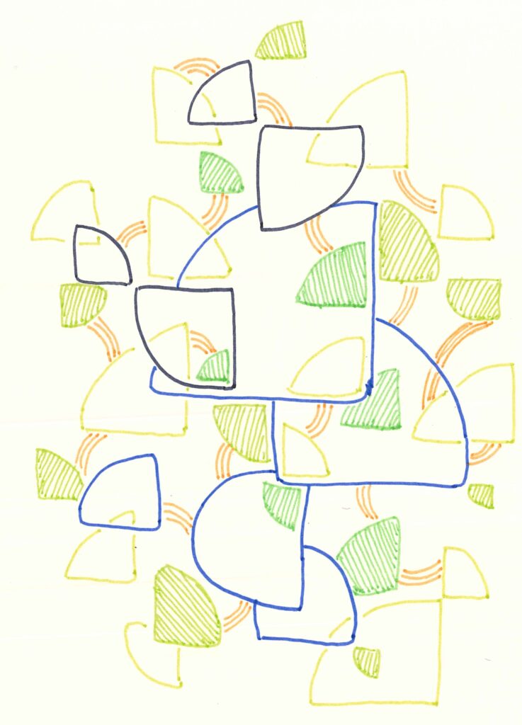
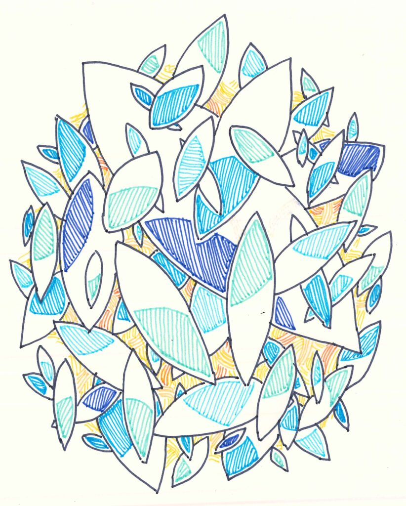
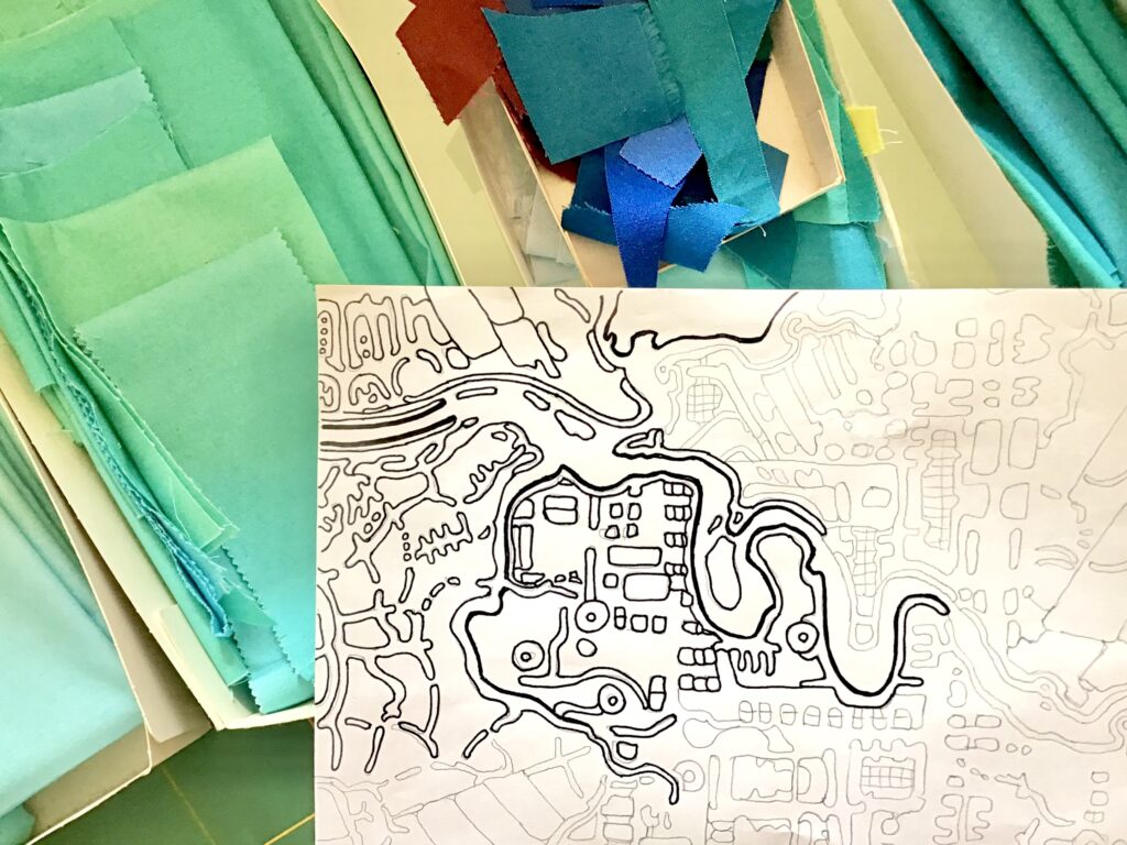
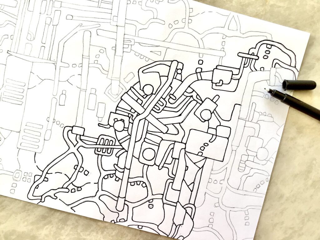
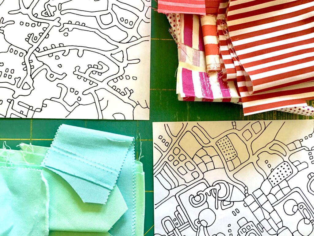
I started to make drawings based on all the maps I had in my collection and in my mind.
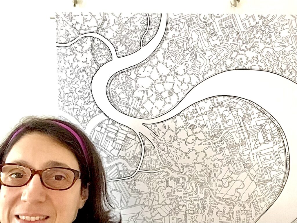
After eight months of drawing, I completed my first large map in black and white.
Its title is: “Free to fly, map of the mind from above”.
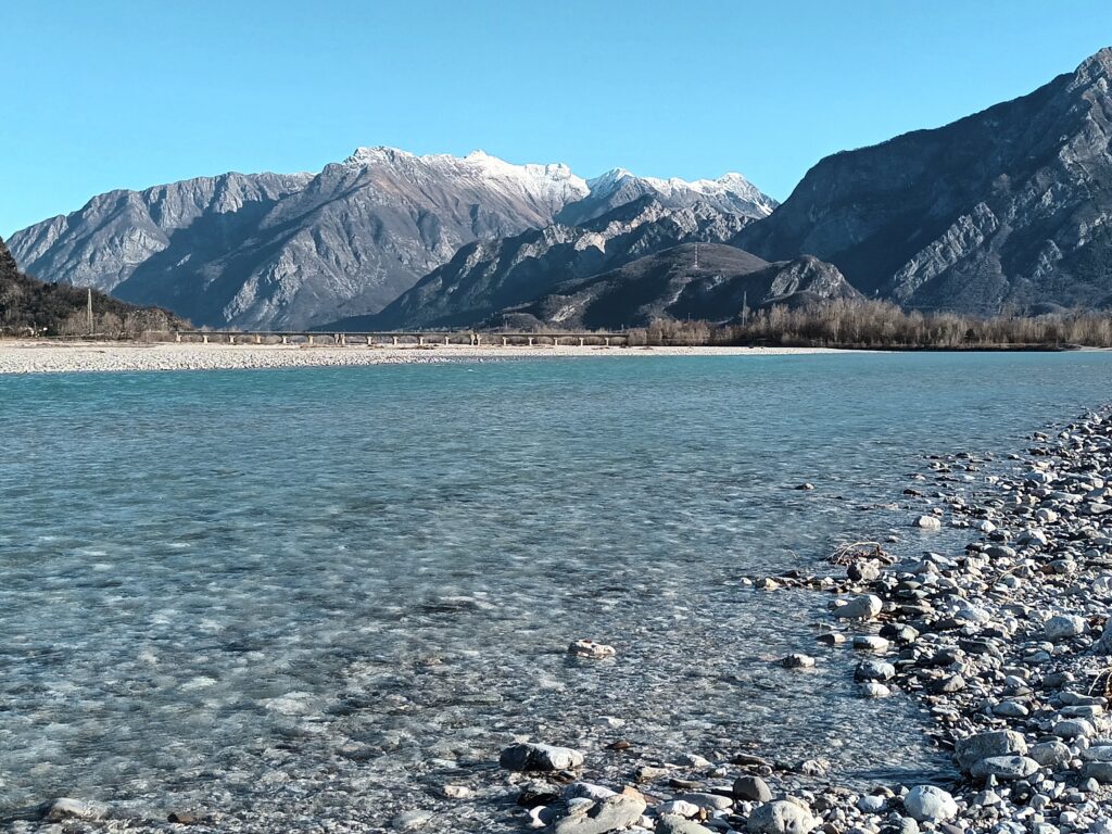
It’s made of about 5000 shapes, traced with ink on paper. Shapes of places that I visited, real maps from travel, from the satellite, from imagination. There are rivers, one of my favorite subjects, there are integrated circuits, from my earlier studies.
I wish to say thanks to David Owen Hastings: during one of his workshops I started my first quilt map, “River gone green”. Then, when I finished this first map in black and white, I was unsure if these neutral colors were OK, after all the saturation I used with fabric. But David made a collection of photographs of neutral quilts from QuiltCon 2025, which suggested him peaceful feelings. And for the second time I felt OK, allowed to proceed in this direction. “Free to fly” means to me peaceful feelings too: when we are capable to leave something heavy behind our shoulders, it’s time to restart, and to allow happiness find freely its route in the mind, again.