
Today I attended the conference on visionary universes by Philip Dick, part of the Science Plus Fiction Festival in my hometown.
The drawing representing the festival was made by comics auhor Sara Pichelli.
It took me a while to notice that the main character in her drawing was not a human but it was a cyborg.
I was fascinated by the concept: it made me think that the first person of a creative endeavor can be a machine and not necessary a human. What if “I am the machine”? Art is a place of freedom and allows ourselves to choose a creative place for one’s self, in an imaginary universe. I am already, since some months, drawing maps where machines are interconnected with natural environmental places. I am an engineer and I have a continuous relationships with machines.

The topic of the relation between humans and machines is well explored in the universe of sci-fi books author Philip Dick. The conference made me reflect on the documentary I watched yesterday, about the machine beating the human in the game GO in 2016, after DeepMind created the machine learning algorithm AlphaGo capable to approach the strategy of this most complex and ancient table game.
Today’s conference was moderated by Giulia Martino who, talking about video games, underlined that games are “art of agency”: a creative way of honing our skills on taking decisions and being an active agent.
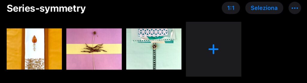
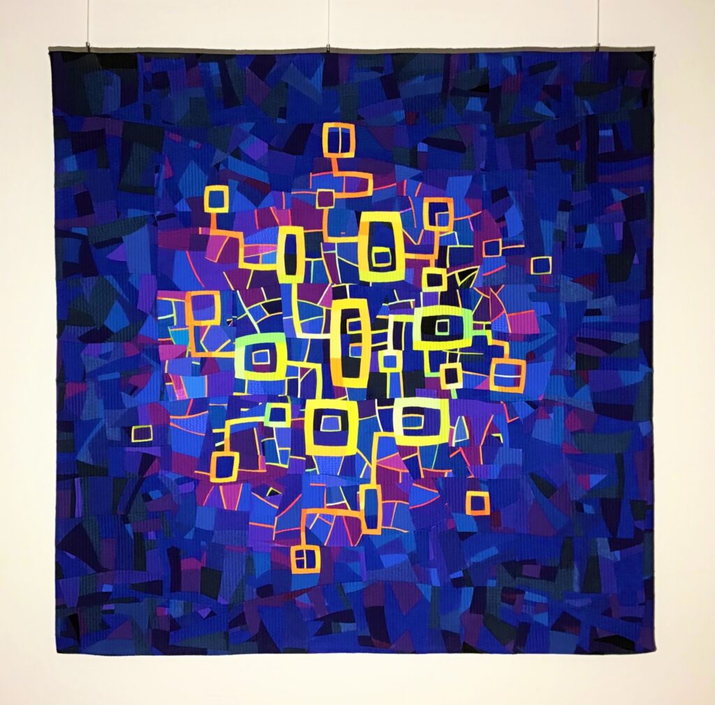
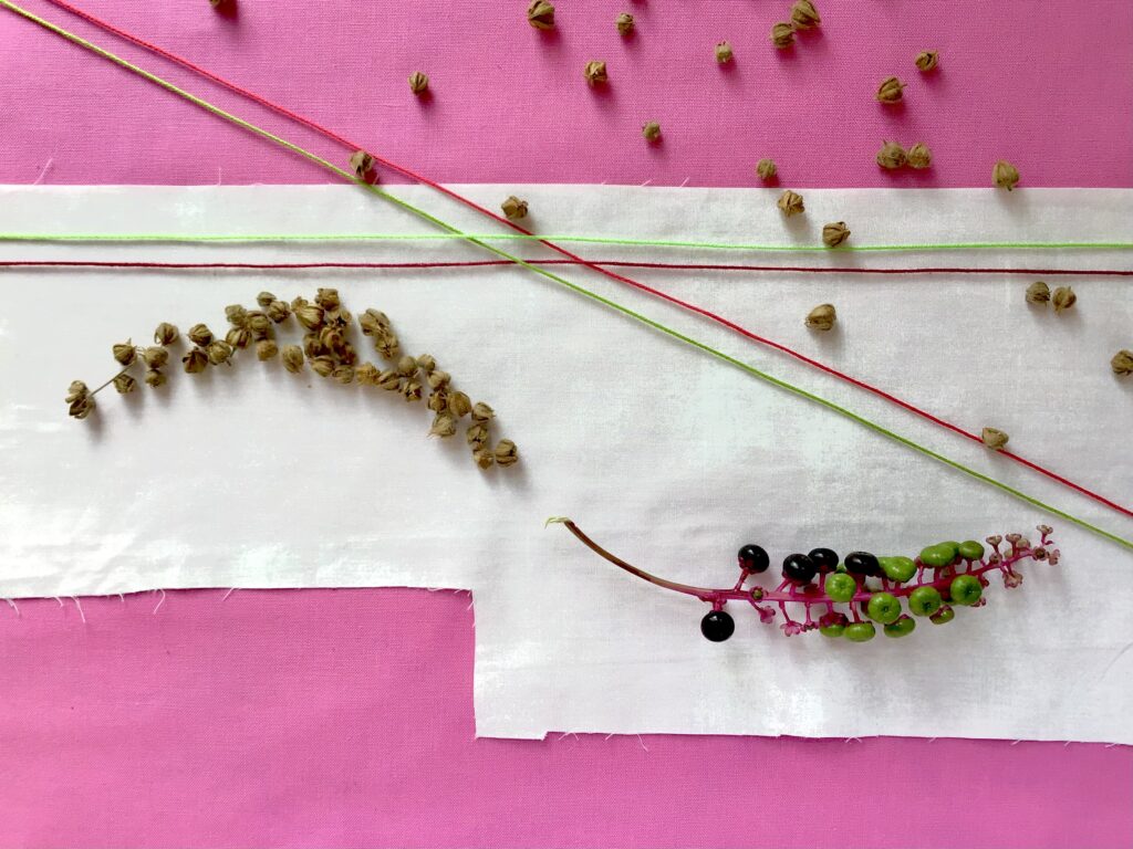
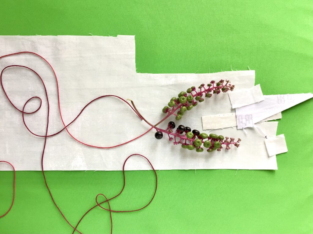
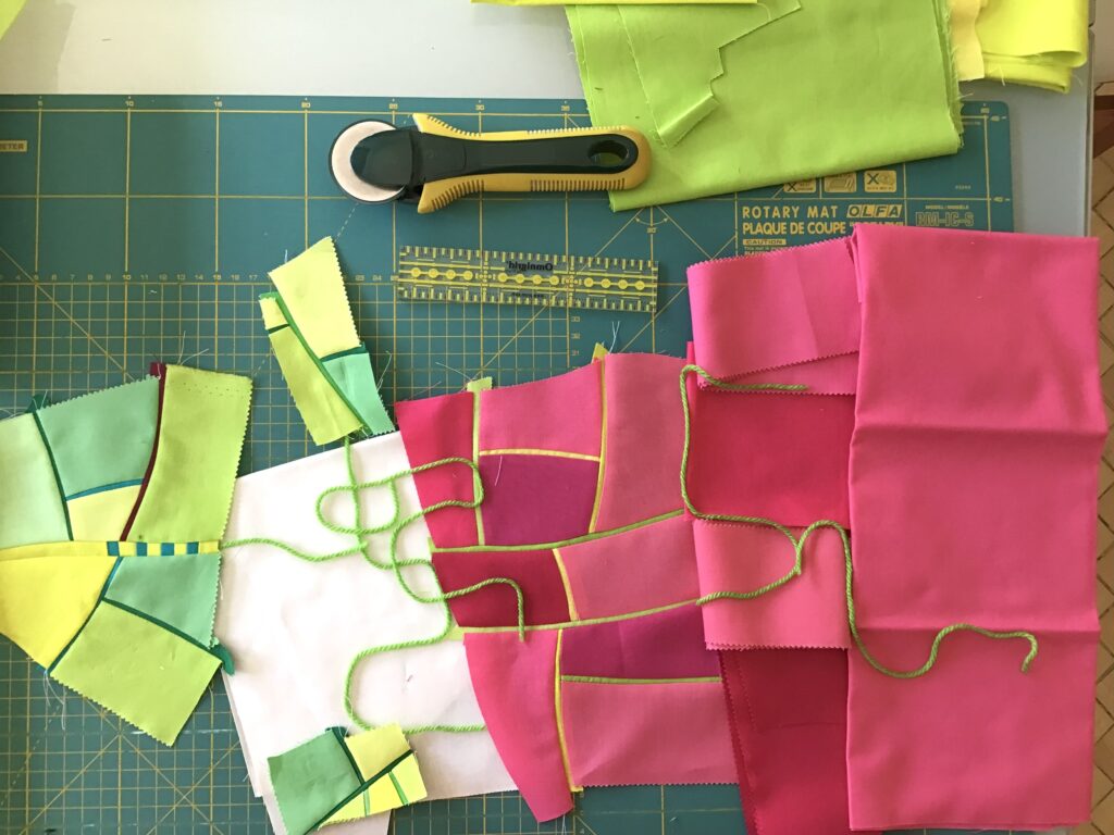
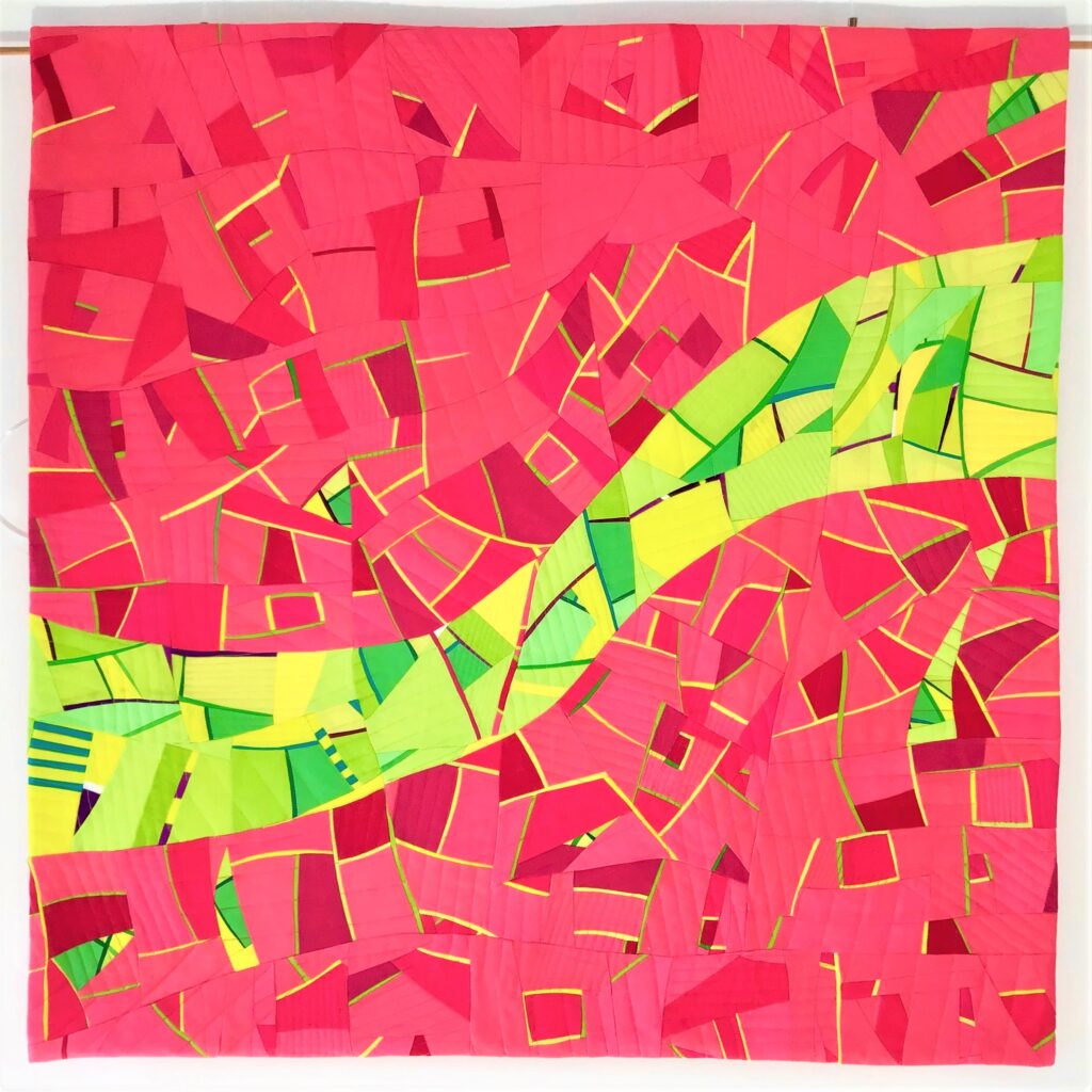
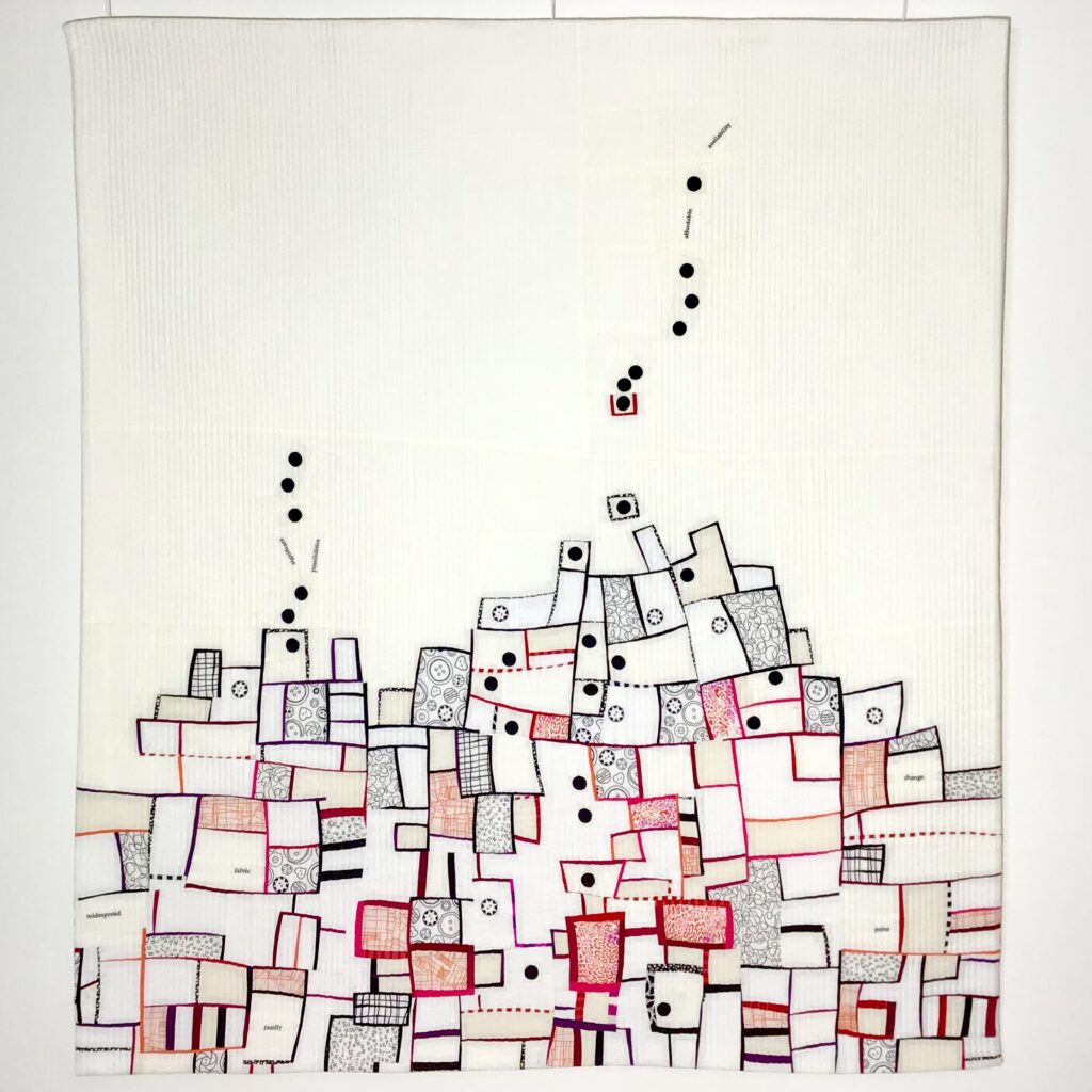
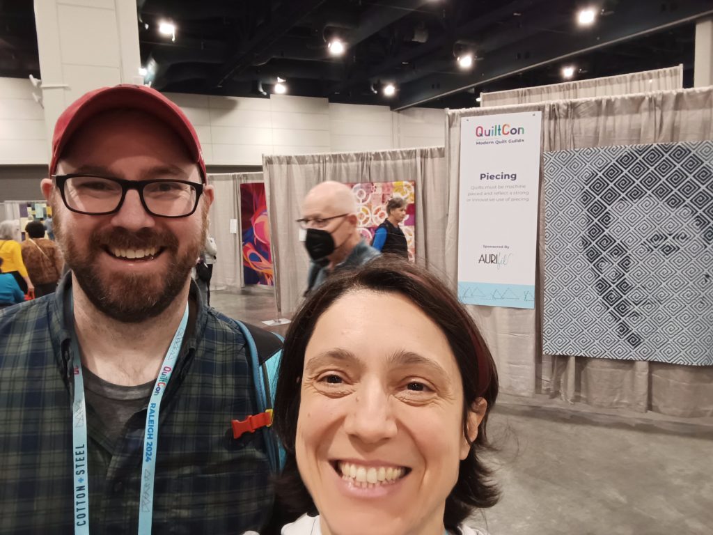
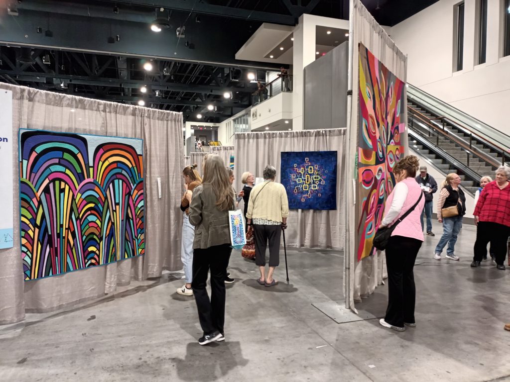
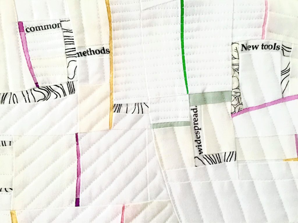
If you want to start a game based on taking decision improvisationally, you may try the improv patchwork game recently launched by Quilt Improv Studio: Modular Rhythms. In the picture below, my first red and white fabric blocks are pieced, to become a quilt part of this game.
For the first time this improv game is made both in person (we launched it one week ago, during a sewing session retreat in Italy) and online. You will see the resulting quilts in the online gallery of the Instagram profile @quiltimprovstudio: this gallery now becomes hybrid, hosting both works started together in person, and works made by quilters from remote places.