QuiltCon in depth

activism, Exhibits, joining events

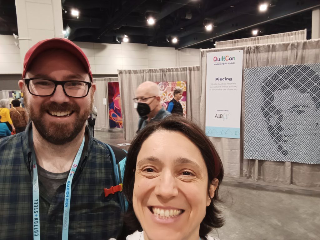
“It takes courage to use, for the first time, an overseas flight”, recognized Irene Roderick @hixsonir, during the breakfast where she kindly invited me, in Raleigh (US), together with other quilters, in a nicely informal eat-together occasion. I was so happy to meet her in person, after the having attended her workshops only from remote. During that discussion, I was explaining that visiting US has not been in my plans ever: I was afraid to go, from my 7.500 miles distant hometown in Italy.

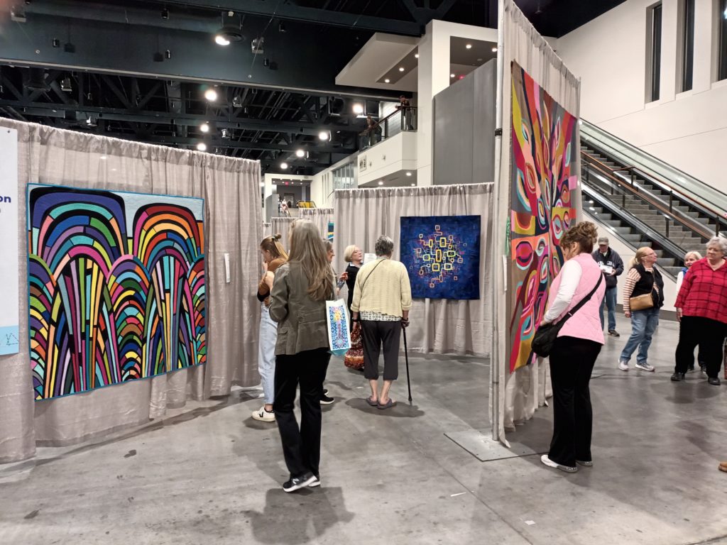
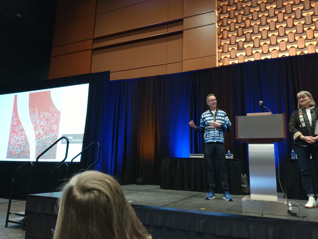
I was convinced to take the plane by the opportunity of attending the QuiltCon 2024 opening lecture by @davidowenhastings and Teresa Duryea Wong @third_floor_quilts who celebrated 20 modern quilts from around the world. Argentina, Guatemala, New Zealand, Korea, Switzerland, France and Italy were represented: you can find the featured quiltmakers on David’s web site here. I am so honored to have been part of the mentioned quilters during this session, attending in presence together with Cecilia Koppmann @ceciliakoppmann, and in the good company of the other mentioned Italian @fabiadelise, whose work I admire so much. I discovered, among others, deeply impressive Korean artists, who give meaning to their quilts with profound care and detail, such as Sung Hye Byun @konnimi who celebrates hometown architectures in a fascinating way, a subject that I love too.

I am grateful to David for having been a “good influence”, inspiring me to visit QuiltCon, and I’m especially happy that he has mentioned that part of me who is an “activist”. My featured work Heat Map is one of my quilts that tell stories of civil action, as I explained on my blog here. I have made other works combined with civil initiatives, such as the one for the petition to save the last savage river in Europe Tagliamento.

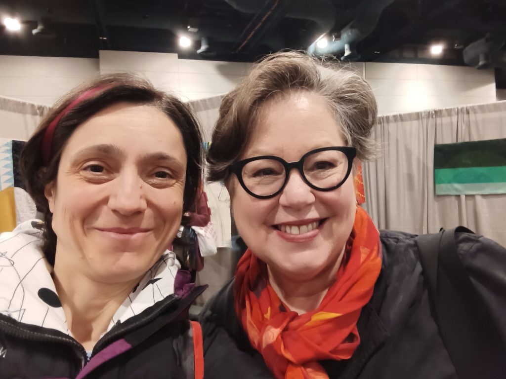
“Let’s transform passion into call for action” is a feeling which I shared with Lorraine Woodruff-Long @quiltinginthefog, who I had the pleasure to talk with. How to select striking messages? I started to wonder if my messages remain too hidden, when confined to the artist statements. For her messages, on the contrary, she uses phrases and images so powerful that I could not smile at the photo taken aside her quilt “The Number of Holes”, due to the severity of the addressed subject, but sure I was smiling and happy during our selfie together! Thanks Lorrain for the time spent talking of experiences we both have had, in connecting art and science dissemination, as she did for the Art x Climate Project at the US Global Change Research Program (I’m so proud that quilts can help raising awareness on such topics, as Lorrain’s quilt powerfully did) and I did 20 years ago for the science communication project “Nanoworld” (you can find it mentioned in my bio). I didn’t expect that the visit to QuiltCon could bring to surface my deep past!

A lot of red

Exhibits

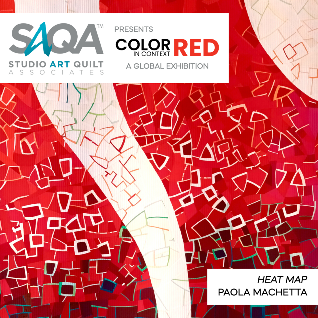
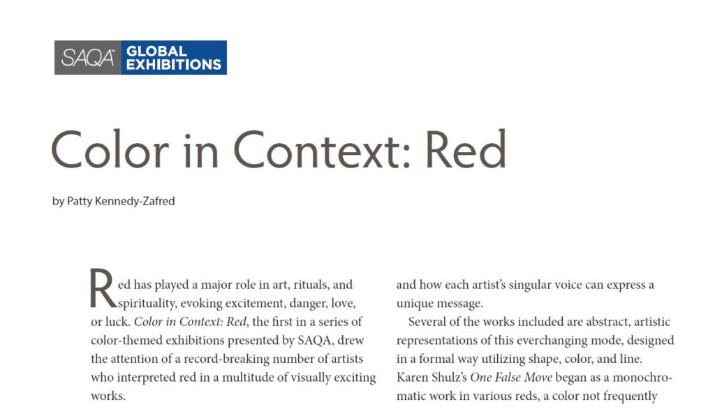
In the latest issue of Art Quilt Quarterly (Issue No. 33), available through the SAQA website at this link, you can find a feature article by Patty Kennedy-Zafred about the SAQA Global Exhibition, Color in Context: RED. My work “Heat map” was included. I’ve described the meaning of “heat map” in an earlier post here.

This article allowed me to discover more about the other works, part of the show, including impactful three-dimensional fiber art. A monochromatic exhibit gets strong in itself!

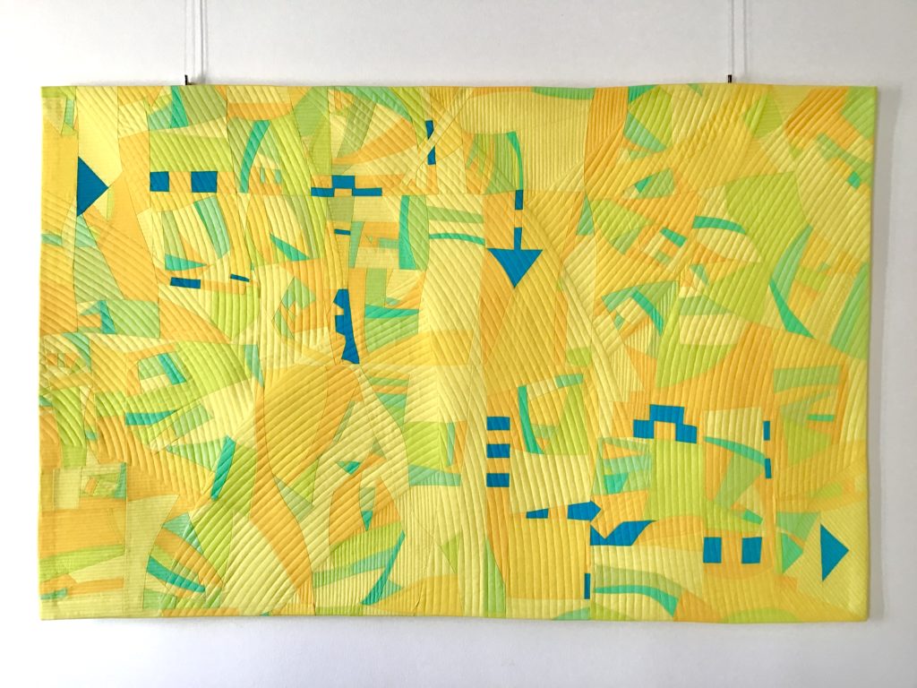
The Color in Context: RED exhibition, with works selected by juror Judy Kirpich, opens on November 2nd at the prestigious International Quilt Festival, at the George R. Brown Convention Center, Houston Texas. I hope you will visit the International Quilt Festival, the largest annual quilt show in the U.S., which regularly attracts 55,000 people from over 35 countries all around the world! I will not be there, but I’m honored to be part of the show. “Heat map” is my second quilt travelling with a SAQA global exhibition. The other one is “Grasshopper path”, part of Haven SAQA global exhibition (heading to the AQS QuiltWeek events in 2024), a yellow quilt shown here below. It seems I have a soft spot for monochromatic textures…

From Australia to Canada

collaborations, joining events

I had the wonderful experience of being interviewed by @janekellyquilts for the “Meet the Makers” section of Make Modern Quilt Magazine. Her questions gave me the opportunity to think about my quilting journey, since its start, to the possible ideas for my future quilts.

I’m honored to find my story published in the now available issue 54, in a beautiful four-pages layout. I’m in good company of many other brilliant quilters, such as Birgitta Jadenfelt, who had her bluebells pattern published in the same issue.

Since the magazine is fully digital, it can immediately reach distant locations. Such as Canada, where Linda McLaren had the kind idea of bringing my mini quilt “Giraffe’s rock” to the London Modern Quilt Guild Canada Show, as an example of the MQG Make a Mini Make a Friend swap. The article featuring me, from the just released Make Modern issue created in Australia, was pinned to it by Linda, who had been paired with me in the swap. Connections within the quilting community run quick!

The quilt with a secret code

improv process

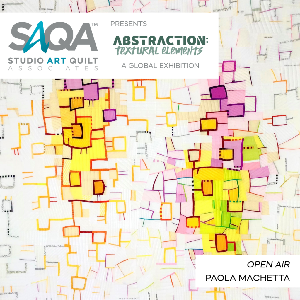
The third and last episode of the series “The secret lives of quilts” of this Summer is out on Patchworkvictim blog, on its YouTube channel, and here above! This episode tells the story of the quilt “Open air”.

I made “Open air” at the end of the pandemic period. It was started in one of the workshops with Irene Roderick, which I had the opportunity to attend in the on-line mode. This quilt expresses the feelings you can have when you get out of your home, after a long time spent in the inside. In that moment, the air outside feels so fresh, the light so bright, that it almost surprises your eyes for the sudden change of luminosity. I tried to express this in my work, thanks to the large amount of white fabric used, and I always feel good still now when I look at “Open air”.

For this quilt I also used printed fabric with text. This is a way of working that I adopted after having met the quilter Linda McLaren: it was Linda who proposed me to try fabric with text in a previous work and I continued also in this case. I placed words spread around in the texture. Sometimes these words compose a sort of a message; in some other positions they are put casually. So, we may say that this work is a quilt with a “secret code”.

Follow the track of the quilt

Exhibits

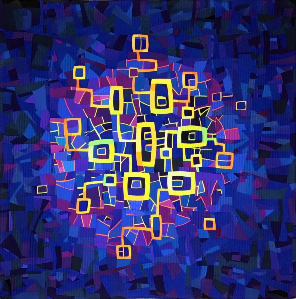
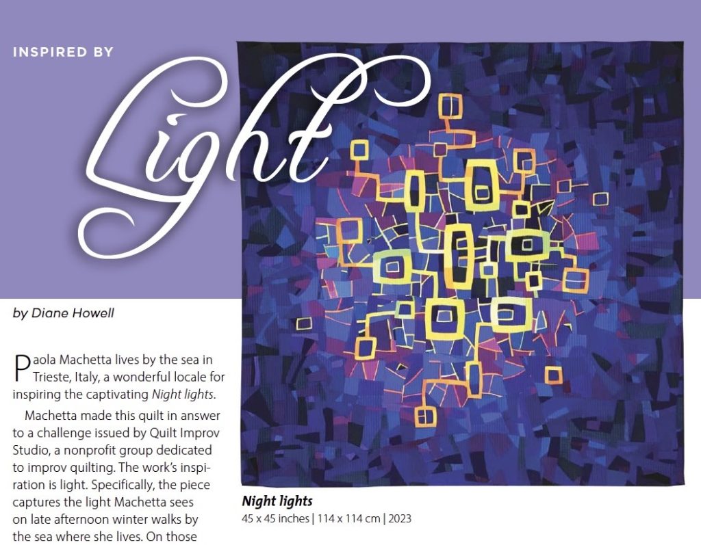
The second episode of the series “The secret lives of quilts” of this Summer is out on Patchworkvictim blog, on its YouTube channel, and here above! This episode tells the story of the quilt “Night lights”, made for the game #qisdualism by Quilt Improv Studio.

This quilt refers to the dualism of darkness and light: the lights have a special character during the late hours and I tried to represent their brightness being more piercing, when coupled with their opposite in the background.
I like to walk in the night towards the sea, beyond the last streetlamp. Yellow reflections swim on the water waves, under a black sky.
I like to be in energy saving mode, in the last hour of the day at home. Streetlamp rays filter through the window tile, scattering light marks on the dark wall.

I made a blue-tooth-tracker pocket in the lower part of my quilt sleeve. After reading shipment loss (and late retrieval) story shared by @quiltinginthefog, I adopted, already since this year start, the solution to follow my quilt tracks. I was struggling for a good place for the tracker, to avoid bumps in the quilt back. When @quiltinginthefog confirmed that she chose a place near the sleeve, as I was thinking too, I went for the solution you can see in these pictures. I was much reassured by seeing the track of my quilt, until it arrived to the Festival of Quilts in Birmingham, UK.

Here below you can see it hanging in the show!

Heat map

activism, collaborations, Exhibits

The first episode of the series “The secret lives of quilts” of this Summer is out on Patchworkvictim blog, on its YouTube channel, and here above! This episode talks about the quilt “Heat map” and the fabric I’ve used to make it.

Most of my quilts refer to happiness, beauty, and the delight of nature.
But last Summer, for the first time, I had very strong and opposite feelings. Anger, and pride. My quilting practice could not avoid embedding some of it. These days, while I was making a quilt aimed for the SAQA challenge “Color in context: Red”, I marched in the biggest parade experienced by my city in years: 15.000 persons joined from so many different communities. The tv showed for days videos including my position in the front line of the parade, while I was waving the flag of my labour union; its color was red.

Thanks to SAQA Exhibitions Committee and to juror @judykirpich: I’m honored that my quilt “Heat map” created in that period, has been selected for the SAQA global exhibit “Color in context: Red”!  For this quilt I tried for the first time the longarm service by Giulia Molon @quiltlovestudio: thank you Giulia for finding the perfect thread solution to match with my work.

In this detail picture below, it can be gained a sense of the different red fabrics I’ve used. It was the first time for me to piece red on red, and I discovered that I have some preferred and favorite red among others. Do you have a favorite red too?

Meet quilters in Verona Tessile

Exhibits, joining events

I visited Verona Tessile, a festival set up to give impetus and visibility to textile art in Italy. Organized by the Ad Maiora Association, in collaboration with the Verona Municipality, it took place in museums, churches, in the city center. Its title was “Impavide” which means “fearless”. And it was a great experience.

I had the honor to be part of a group exhibit, in the Fresco Museum Giovanni Battista Cavalcaselle, and to get to know in person the other invited artists. Here above you can see a quilt by Giovanna Nicolai displaying colors similar to the fresco painting. Here below there is a view of one of my quilts, hanging in front of the fresco painting representing emperor Carlo V and pope Clemente VII as knights.

The main venue was the Gran Guardia Palace, outstanding building hosting several exhibits, including the show by textile artist Margaret Fabrizio (see her green and purple kawandi here below) and by the Swiss guild PatCHquilt. The first red quilt here below is titled “There is no grey”, by Lisa Hofmann-Maurer, Swiss, and is part of the “Red shoes” gallery by PatCHquilt guild. It has a strong meaning: there is no grey area when talking of violence against women. It has to be condemned straight.

My favorite memory of those days is the lunch with quilters, in some cases met for the first time in person, after long time of virtual contact sharing our common passion. With Giovanna Nicolai, Mattea Jurin and Ally Ryde I felt in my natural element: we could freely talk about our creative process and ideas for hours!

Verona has its beauties, and Ally guided me among those. I discovered the modern architectural approach by Carlo Scarpa, in the renovation of Castelvecchio museum: you may notice modern glasses in ancient windows here below.
Celebrating Verona’s buildings was also part of of the show, as in this impressive quilt titled “Romeo” by Laura Armiraglio.

The floor of Verona pathways reveals red shells of the type “Ammonite”, embedded in the ancient pavement stone: when you start noticing them, they appear bigger and bigger under your feet!
Red curves were also the inspiration for the quilt “Flamenco” by Brigitte Rossetti, Swiss, part of the “Red shoes” gallery by PatCHquilt guild. Brigitte explained me how she started freeform cutting of fabric several years ago, and this quilt clearly demonstrates it!

Verona Tessile has an international reach. This gave me the opportunity to meet in real life quilters from distant places. It was the case of Pasqualina Barazza from Switzerland, part of the “Red shoes” gallery with her “Turmoil of red shoes goes to court” (here below), and of Tatyana Vlasenko from Ukraine, who loves the subject of rivers like I do, as shown by her work “River islands on Dnepr” part of the gallery by Ukraine Patchwork Masters.

Isn’t it better to hear quilt stories directly from the voice of their authors? Such as for the work “Blue and green music”, described by Mattea Jurin in the photo here below.

This biennale textile art festival displayed more than 300 quilts. The collective work “The starry night” alone was made by 185 panels created by a multitude, inspired by Vincent Van Gogh painting, during the lockdown period.

Women from the past were celebrated by the contest “Fearless, female artists in history”, such as in the work “Heartist (artist with the heart)” by Aurora Calvet from Slovenia, rainbow picture here below.

The festival continued in many locations, including windows in the city center, where a nice match was found among the product and the quilt, such as in the window shown here, displaying the black and white work by Agostina Zwilling and Maria Teresa Sansotta, president of Ad Maiora. I wish to say thanks to Ad Maiora Association for having made all of this real!

Participation to textile art festival Italy

Exhibits

Verona Tessile is a festival set up to give impetus and visibility to textile art in Italy. Organized by the Ad Maiora Association, in collaboration with the Verona Municipality, it takes place in museums, churches, in the city center, in beautiful and evocative locations.

I am honored to be part of the 5th edition, taking place from April 30th to May 3rd 2023, in one of the many historical settings in the city where the festival is finding place. My works will be part of a group exhibit, in the Fresco Museum Giovanni Battista Cavalcaselle, and the names of the other invited artists are a sufficient reason to look for this venue!

In this occasion, the quilts I made in parallel with Giovanna Nicolai (in a period when we agreed to try an identical palette of fabric) will be hanging together with the works made by her at that time. Our modern quilts will be in a dialogue with the fresco painting from year 1580 representing emperor Carlo V and pope Clemente VII as knights, permanent exhibit in the same room.

More than ten locations, internationally recognized artists, quilting challenges and social themes will be part of this edition: all good reasons to visit the event!

Textures connect with Nature

collaborations, improv process, joining events

During March 2023 I had the opportunity to present my talk “From the microscope to the sky” to SAQA Texas, in a zoom gathering moderated by Susie Monday, Texas Regional Representative of Studio Art Quilt Associates. Susie, together with me, will be part of the Color in context: Red SAQA global exhibition. 

I explained how I am inspired by textures that I find in nature and during my professional experience.

I have used photography for twenty years, and among my past photo galleries there was one fully dedicated to textures visible in the reflections on the surface of water.

I started to use microscopy during my thesis work at the University, and the pictures I gathered in that period became part of a science communication project which travelled around Italy for some years.

I am still using microscopy and other imaging techniques, such as optical microscopy, scanning electron microscopy, x-ray tomography and ultrasonic testing: I have a professional relationship with images and I continuously work extracting technical meaning from raw abstract pictures.

When I put my recent texture quilts aside to the images obtained at the microscope, sometimes I find they have similarities. I don’t use photos as a direct source to make a quilt as a replica of the subject, but the library of pictures filling my memory surely influence my quilting practice.

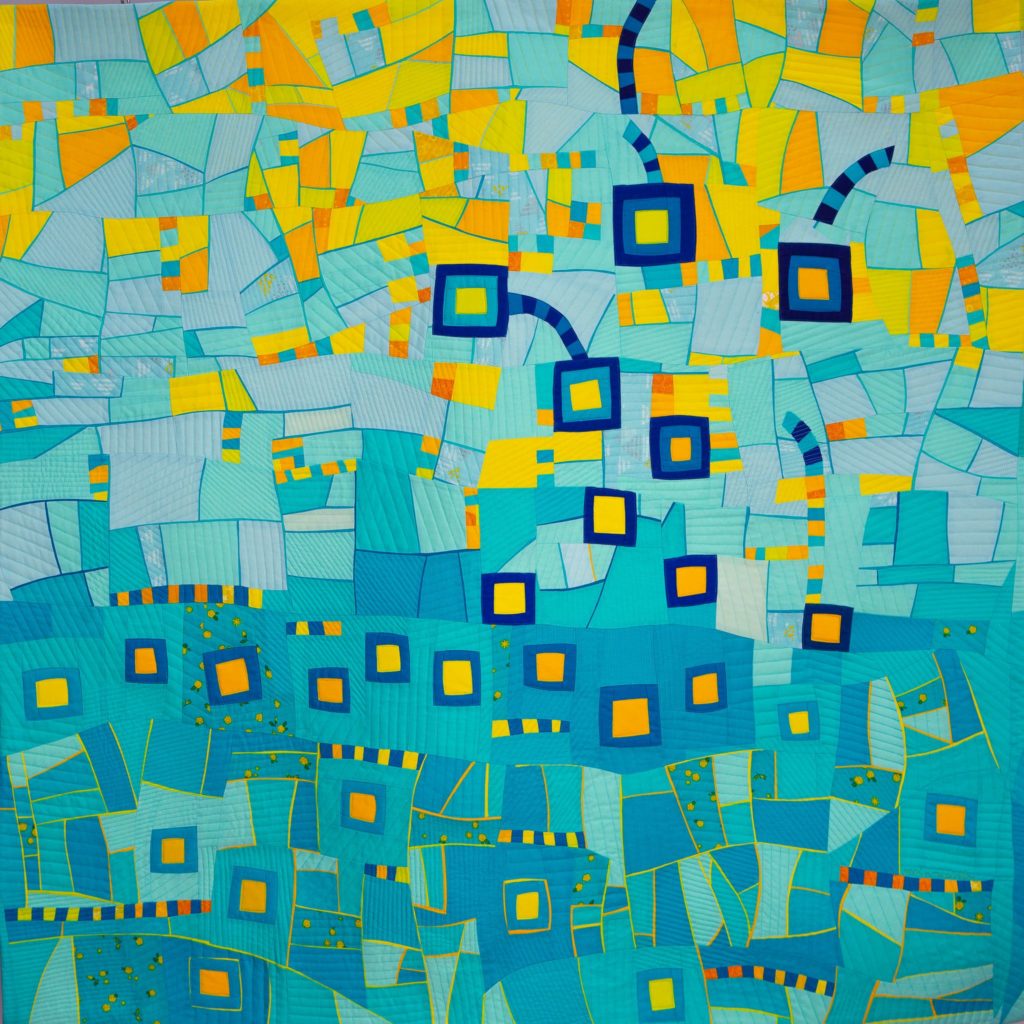
Ally Ryde described my works as “quilts of places”. My last quilts are a collection of landscape textures, such as: Grasshopper path, Sealights, The space between the clouds and River gone green.

After many quilts dedicated to exploring this subject, I have the feeling that textures spontaneously speak of Nature. Since ancient times, our brain needed to recognize the variation of a popping fruit among the dense foliage; to spot the movement of creatures approaching through the thickness of the grass.

We are specialized in looking at textures.
And this experience is a continuous pleasure.

The meaning of a map

improv process

Last Spring I joined a virtual workshop led by David Owen Hastings, named: Inspired by art. As inspiration source, I chose the super detailed maps by graphic designer Thomas Ashley. The workshop was interesting and comprehensive, and it activated visions since its beginning: it started with a wonderful imagery that David shared from his countryside!

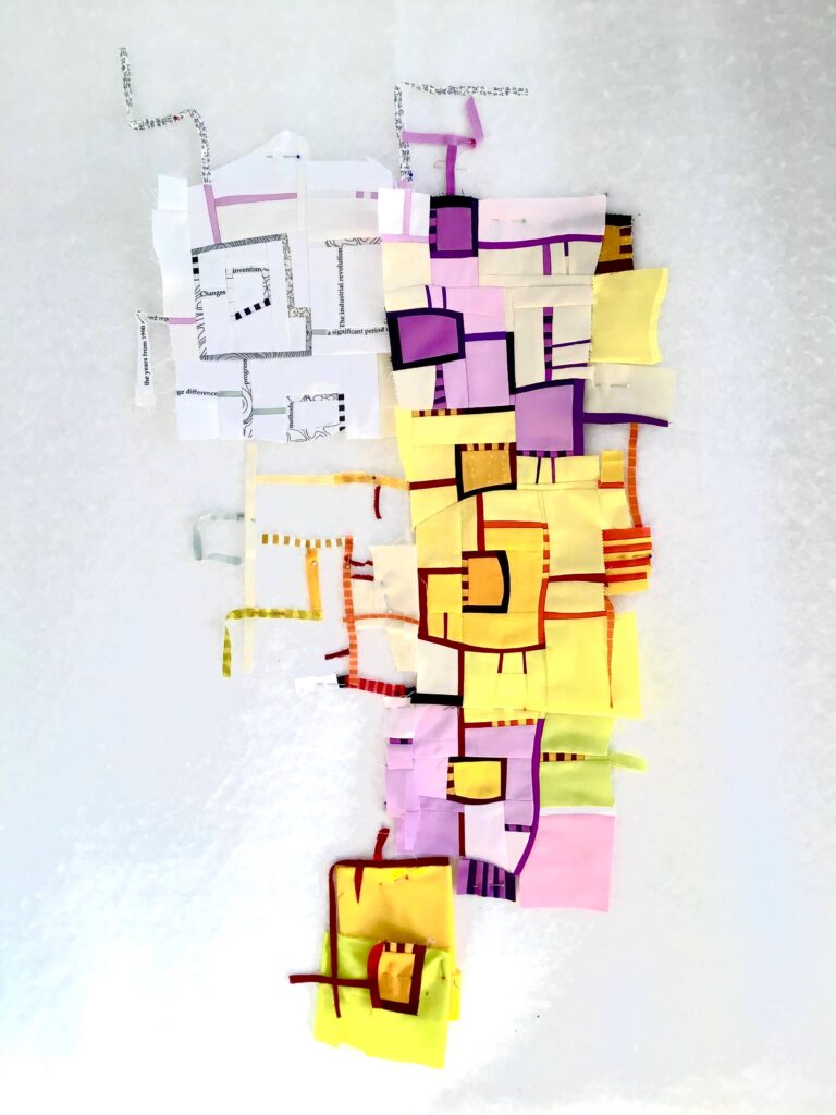
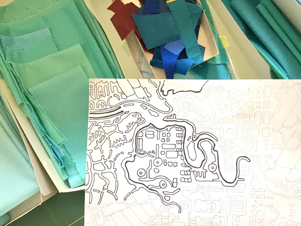
As a workshop exercise, I drafted a fuzzy section of a map on my design wall.
I recalled the awesome works of gorgeous map quilters such as Alicia Merret, Leah Evans and Niraja Lorenz and, with some doubts, I asked myself: why making one more map?
In a conversation after the workshop, David encouraged me: he was very kind, and the map idea found quiet settlement in some place of my mind.

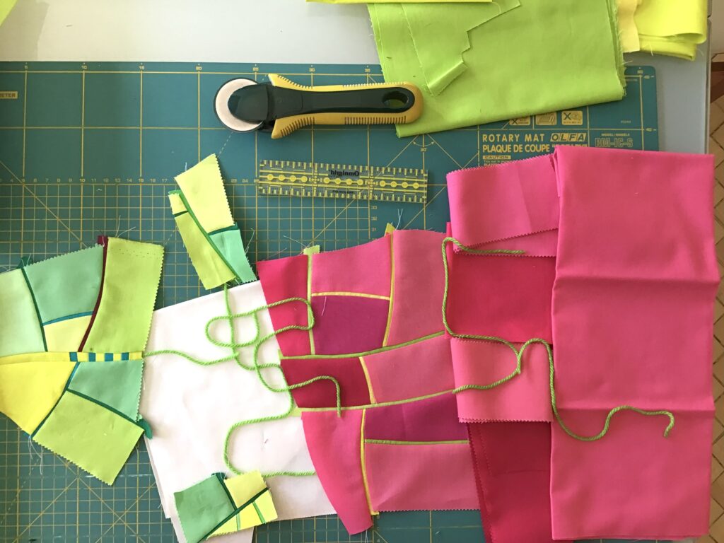
During this Summer, the occasion to elaborate this subject topic came again, thanks to the game launched by Quilt Improv Studio, Pop improv challenge: I randomly started piecing some acid green fields. And suddenly, from my design wall, a message appeared so strong that I didn’t dare to touch the pins and to adjust the vision. I found reply to my earlier question: “It depends on what you want to say with your map”.

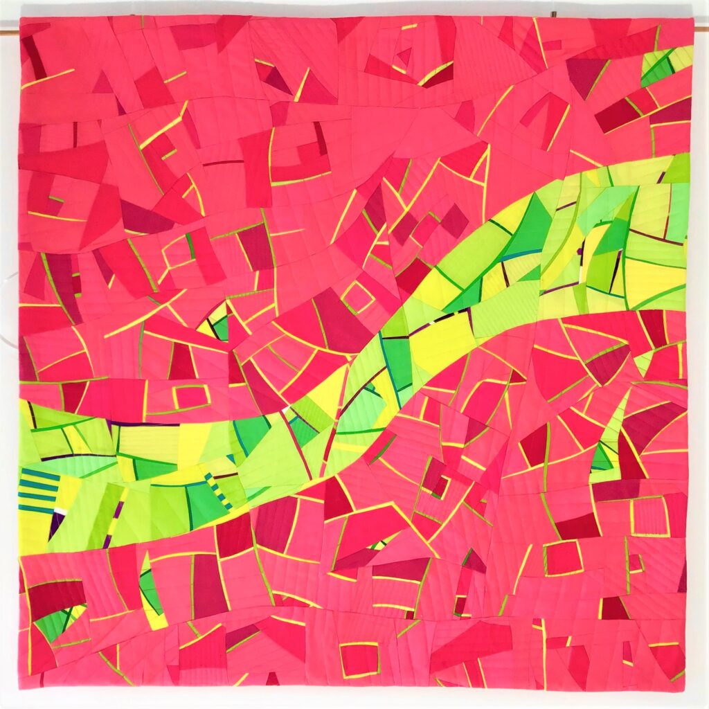
This is the story of my quilt made for the Pop Improv game. Its title is: “River gone green”.

This Summer our family holidays found destination in Spain, to the ancient city of Valencia.
Valencia was founded as a Roman colony in 138 BC. Building site were the banks of the River Turia, alluvial silts accumulated on the floodplain formed in the lower course of the river, which were highly fertile.
Valencia today is one of the world’s top rank global cities: a primary node in the global economic network. But centuries of development changed its relationship with Nature very deeply. Strong growth at the sides of its riverbanks found its limit on 14 October 1957, when the Great Flood of Valencia flooded large parts of the city of Valencia. As a reaction, Turia river was diverted and its coexistence with the citizens found an end. The old course of the river has been turned into a central green space for the city: a cultural attraction known as the Garden of the Turia, which I myself walked in, smitten by surprise.

Acid and saturated colors typical of Pop Art aesthetics, as requested by Quilt Improv Studio challenge, proved perfect to convey through my quilt the message of what happens when commodification of Nature hits an extreme, such as in the story of Turia river bed, not anymore filled with water, but now gone green. Like a glowing ghost of its former stream shape.

Today, awareness that rivers are continuously changing landscapes, which can’t be frozen into a fixed narrow stream (as it happened to the vast majority of the rivers in the world), is well consolidated in the scientific community: leaving room for rivers to flow and flood is safer than building houses too close to riverbanks. The few remaining examples of rivers having a course that still preserves its natural features, such as my beloved Tagliamento river (the “king of the Alps” worth of getting Unesco tutelage), are studied and imitated during projects for restoring damaged river’s health. Didn’t you expect that honoring the wilderness of rivers would also make safer the communities around them?